Dimensions of Political Ideology
Using unsupervised learning to investigate the dimensionality of U.S. political ideology over time.
There are many distinct political issues about which someone might have an opinion. From 2019 to 2021, for instance, the U.S. House of Representatives voted more than 900 times. Naively, I would need more than 900 pieces of information to characterize someone’s political stance in this complex environment. Are you for the Blockchain Coordination Act? How about the Federal Bail Reform Act? Etc, etc.
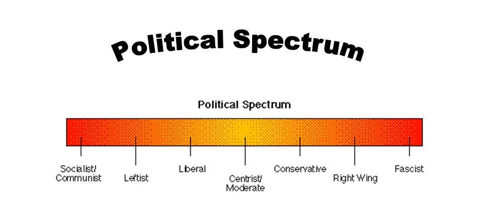
Common sense tells us that we probably don’t need 900 pieces of information to get a pretty good sense of someone’s stance on the issues. Support for one issue is often heavily correlated with support for many others. Sometimes this is compressed down to a single dimension—the person’s position on a left-right spectrum.
Source: The Political Spectrum
Others endorse a more complex two-dimensional political compass, which plots individuals on a vertical authoritarian-libertarian axis as well as the traditional horizontal left-right axis:
Source: The Political Compass
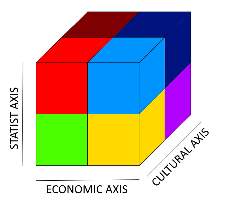
I have even seen some proposals for a three-dimensional political cube, which adds a cultural axis:
Source: Political Cube Template
Looking at these diagrams, a natural question arises. Do any of these simple models come close to describing reality? That is, how well can we actually compress political ideology down to just a few axes?
Using autoencoders to compress political ideology
Neural networks are well suited to solve this type of problem. In particular, an unsupervised learning technique known as “autoencoding” is often used to compress high-dimensional inputs into their best low-dimensional representation.
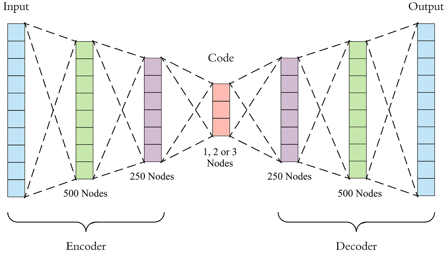
Autoencoders take in a large input and feed it through several layers of neurons (the “encoder”), eventually arriving at a very small layer of the network (the “code”, or low dimensional representation). The code is then fed through more layers of neurons (the “decoder”), eventually reaching an output layer with the same size as the input layer. The autoencoder is trained to reproduce the input as closely as possible at the output layer. In order to do so, the encoder must compress as much information as possible into the code, which is the bottleneck between the two portions of the network.
For this investigation, I used a House member’s vote (0 for nay, 1 for aye, 0.5 for abstain or absent) on each roll-call as the input. For the 116th Congress, this layer had n = 952. I then passed it through an encoder with layers of size 500 and 250 before arriving at the code, which had a small dimension (1, 2, or 3). The decoder was the mirror image of the encoder. The network was then trained to reproduce a House member’s voting history as accurately as possible.
Source: Towards Data Science
The value of the code has no inherent meaning—the network can set it to anything that helps it reproduce voting history accurately on the other side. That being said, there are at least two important pieces of information we can infer from this experiment:
The accuracy of the network in reproducing voting history can tell us how well political ideology compresses down to one, two, or three dimensions.
The relative codes of different House members give information about how similar they are in ideology.
Dimensionality of ideology over time
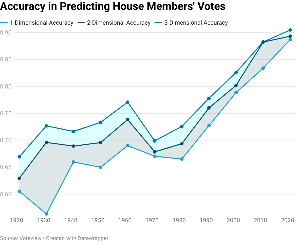
I ran the autoencoder on voting records for the past century. In each case, I measured how accurately the network could reproduce voting records at the output layer. Here were the results:
Some observations:
Political partisanship has increased. Until about 1980, one-dimensional representations of political ideology were not great at predicting how someone would vote, rarely achieving above 65% accuracy. One number is now capable of predicting close to 90% of a House member’s votes. In other words, House members are much more likely to vote along party lines today than they were in the pre-1980 period.
Political ideology of House members used to be more two-dimensional. From 1920 to 1960, two-dimensional representations of political ideology were substantially better than one-dimensional representations at predicting votes. In 1931, the improvement was almost 15 percentage points! Today, adding a second dimension gets you only a 0.6 percentage point increase. The same is true of three-dimensional representations. The rise in partisanship has collapsed what used to be a grid or cube into a one-dimensional left-right spectrum.
Ideology of current House members
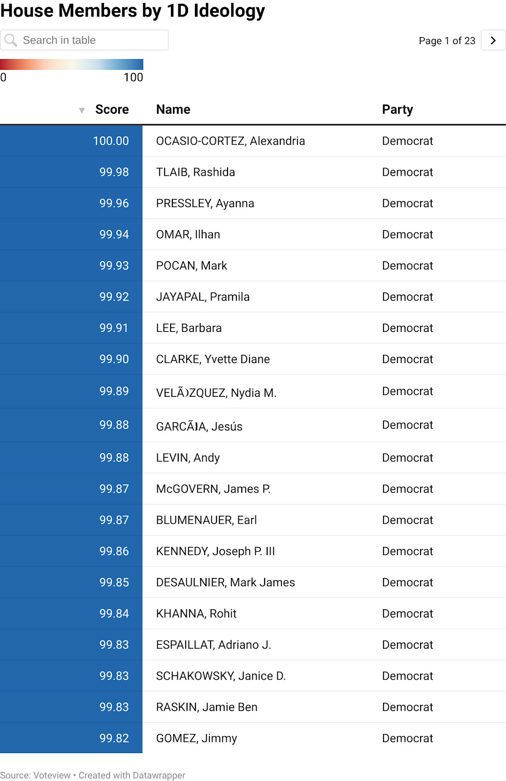
I used the “encoder” half of the network to compute one-dimensional scores for 2021 House members. Only the beginning of the list is below, but you can explore the full searchable visualization here.
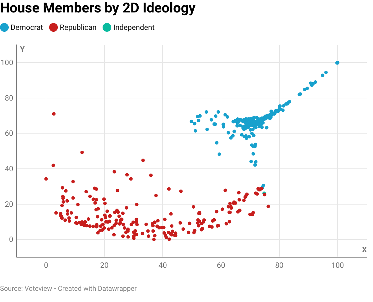
I also computed two-dimensional scores for each member. The graph is below. A full visualization with labeled names is here.
Some observations:
Democrats are much more closely clustered than Republicans. The exception is a spike in the upper-right, which has “the Squad” as its tip.
There is a bipartisan cluster in the middle right. This grouping includes Nancy Pelosi and both independents.
Note that the two-dimensional graph is not on the same axes as the political compass. In fact, the extra dimension is probably not particularly meaningful, given that two-dimensional accuracy is more or less the same as one-dimensional accuracy. A possible next area of exploration is an examination of two-dimensional graph for the 1931 House, which does appear to have a significant second axis.


